
Exploring color stories in museum exhibitions.
By Guest Blogger, Luanne Stovall, Artist, Designer & Color Theorist.
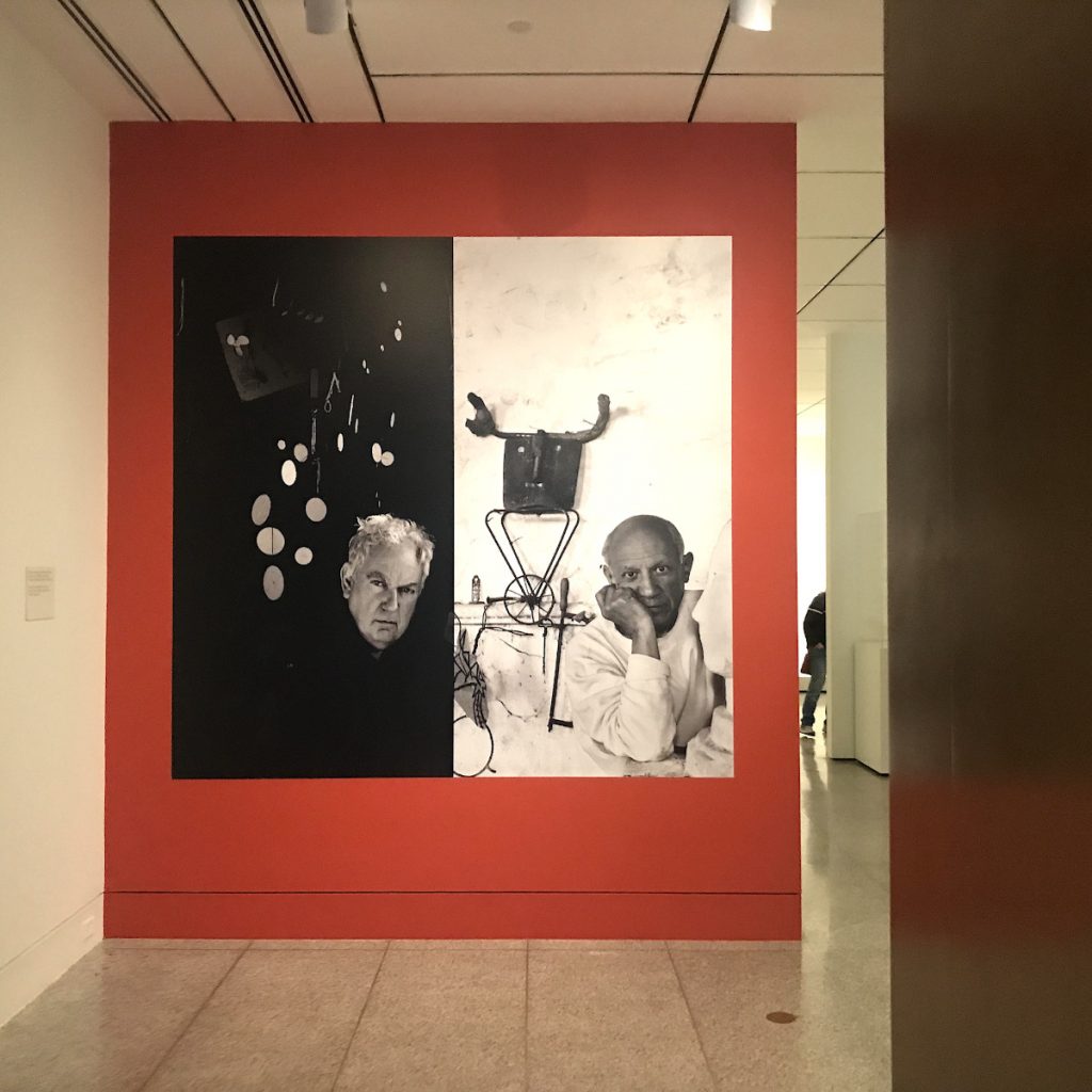
Alexander Calder and Pablo Picasso, Museum of Fine Arts, Houston.
Whenever I visit a new museum show, I always check out the color palette first. The colors featured on the banners outside, the splashy title inside, the merchandise in the gift shop, the art itself, and especially the gallery walls are all part of an orchestrated color story. Together, they might establish the theme, set the mood, echo or contrast with the artwork, and more.
I’m so obsessed with color myself, I usually try to guess what the palette will be before I get there! For most of us, though, color tends to operate a bit under the radar. We generally focus more on the art and ignore the walls. Yet even if we don’t realize it, the colors in the exhibition affect the way we see the art. Light or dark, warm or cool, saturated or muted, the color story is full of important information hidden in plain sight.
Going to an art museum is a great way to practice color theory because every exhibition offers a case study in color interaction. There’s also the whole underappreciated territory of “color codes” to consider—all the overlapping meanings, ideas, associations, and (usually hidden) biases that colors carry with them.
Working deliberately and appropriately with color stories is one of the keys to good exhibition design. It’s also the kind of thing that bothers the hell out of me when it’s done poorly. So I decided to begin a series of posts exploring how color palettes function in art exhibitions, starting with my recent visit to the Museum of Fine Arts, Houston.
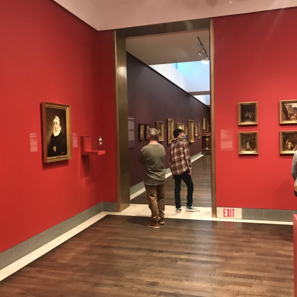
The American Galleries, Museum of Fine Arts, Houston.
Last week, I went to Houston to celebrate my birthday and soak in some art. The Calder-Picasso show was on my must-see list, especially since it was about to close. I was pretty sure the color palette would include fire engine red because Calder’s bright red-orange sculpture The Crab sits just outside the museum’s front door. Calder often included this bold hue in many of his playful sculptures and mobiles—alongside deep blue and optimistic yellow, the symbolic color triad of the 20th century. Fire engine red is hot, dangerous, and modern. Superman wears it. So do lots of other superheroes.
Picasso needed to be represented in the palette, too—and he was. In 2013, Picasso Black and White opened at the museum, a major exhibition focused on his lifelong exploration of these powerful yin-yang colors. As the lightest of the achromatic colors, white provides a neutral, serious, and sometimes sterile background that promises not to compete with the art. For decades, white or off-white has been the fallback choice for most gallery walls. White and black not only pair well with each other, they also look great with any kind of red.
Indeed, every wall but one in the Calder-Picasso show was coated in some version of white. The title wall was white, with black and red text. The second wall was painted fire engine red, an eye-catching frame for two large-scale black and white photos: one portrait of Calder, the other of Picasso.
If anything, the color balance could have been shifted a bit more toward red without overwhelming the viewer, in homage to the frisky spirit that animates the work of both artists. But overall, I thought the color strategy was effective. The restrained dose of high-energy red set the tone, while the tried-and-true white walls allowed plenty of breathing room for the art.
As soon as I left the Calder-Picasso show, I noticed another luminous red emanating from a nearby gallery. Curious, I followed the glow into an installation of early American art, fashion, and furniture. Here was that screaming fire engine red again. Only this time, it took over every wall, drowning out the art. They even doubled down on the garish gold frames around most of these paintings by covering not just the trim, but entire doorways with metallic blasts of gold. So much for balance!
The cacophony of red and gold in this gallery was cringe-worthy on several fronts, worst perhaps because it suggested that the museum was selling its own collection short. Were they trying to lend these “dusty old” works more pizazz by revving up the walls?
When you present shiny gold frames like these against so much red, they appear even brighter. Inside the frames are paintings of respectable citizens wearing their Sunday best, as well as the occasional landscape. The color palette in the artwork is deliberately restrained, with an abundance of warm and cool browns and touches of black, gray, and white. Seen against an all-encompassing red, however, the subtle pigments used by the artists end up looking muddy, drab, and dark.
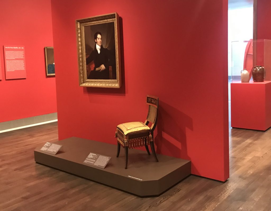
To appreciate the subtle nuances of color in the artwork, the color story on the walls would need to back off and turn down the volume. Any more neutral tones could work, from colonial blue to mossy gray-green. If the design team really wanted to use red, they could choose a deeper shade of organic red, a warm earthy brown, or a lighter tone of reddish-gray.
Whether or not we’re listening, the walls are always talking. So for all of us color designers out there: what do we want them to say?