NOVEMBER COLOR ALERT®
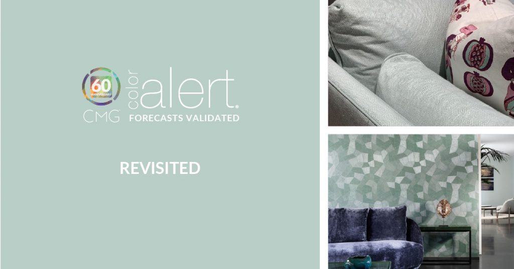
Celebrating the familiar with the new is the essence of Revisited.
Colors that bridge nature and technology have become more important in product design and living/working spaces. They are able to offer a respite from a busy day of meetings and projects yet maintain a subtle connection to technology.
Revisited is a very soft blue with an abundance of green influence. With minimal darkness and chroma, it slips easily into the consciousness of design. Created in North America CMG meetings to emerge in 2022, it is being recognized as a global color. Embraced for its dual connection to hyper-local and virtual communities, it is a color that moves design forward for an evolution in color and its application.
Familiar as it conjures the cool green of glass as well as a flowing stream, it is also the glass of a monitor with virtual and augmented reality behind it beckoning a world of freedom and bright futures.
It is very much a color for the built environment, adding a sense of ease to interior spaces, both residential and commercial. Revisited , true to its name, offers a familiar respite from the madness of the outside world. The relative comfort found in the color is enhanced further with special effects and finishes. As a décor and accessories color, it adds quiet connections to other elements in the space. Think of using it as a color of communicating that connection, not too obtrusive, yet still there to add a comforting color note.
Many textiles will use the color as its key look, or be content as part of an overall color palette. It adds freshness to an eco-inspired collection of tans, brown and terra cotta, and with its relationship to tech elements lifts the solemnity of grey and silver. It can also channel nature in consumer goods and small appliances for that same touch of connection between nature and technology.
Finishes and effects, as well as textures, always add dimension to color, and so they do with Revisited. Various sheen levels can change the look from calming nature with a matte finish, to crisp and otherworldly with a high-gloss or mirrored appearance. A metallic effect adds to the high-tech side of the color and creates visual dimension to mimic enhanced reality.
Familiarity is a good thing, comforting and real, and visually connected to changing lifestyles and technology. Revisited is an ideal hue for moving forward with a sense of calm.
Stay connected in color by signing up to receive our FREE monthly Color Alert®.
Follow #ColorAlert #ColorSells
About CMG’s Color Alert®
View our Color Alert Archives

