2020+ World Color Forecast™ Key Colors
Color Marketing Group, the leading international association of color design professionals, introduced the organizations’ forecasted key colors today at the 2018 International Summit in Philadelphia, PA.
CMG 2020+ Asia Pacific Forecast Key Color – Seed of Life
Creating a base color from which others can grow, Seed of Life delivers a statement of simplicity and origin as it offers direction counter to the busy-ness of life. Such is the trend-forward message of Seed of Life, the Asia Pacific Key Color for 2020+. Born of nature, this warm, neutral beige succeeds in adding a sense of calm, and connection amidst modern scenes.
Nature and sustainability continue to be important trend directions and Seed of Life offers a glimpse to the story behind the trend. It is the color of seeds, grains, and of dried grasses wafting in the breeze, it connects us to the earth, to our food sources, and ultimately, to one another. Seed of Life represents the staples of life.
Seed of Life is the antithesis of rampant technology; it is the color for going off-road, for exploring, and for returning to one’s roots. It becomes the chromatic off-button to wind down and inhale a moment. Dealing with unhealthy work environments, managing our own time schedules, and accepting a self-focus that is imperfect, but unpressured, Seed of Life relieves tension.
The color Seed of Life is a catalyst for items that connect us to nature, offer tranquility, and help us to lead better, healthier lives. The items we make will evoke vitality as they express imagination and the positive energy with which creations emerge. Woven handcrafts suggest a sense of history with designs rewoven for a new perception of social dynamics. Whether art, utensils, or furnishings, creations of polished woods will invite you to caress them, feel the grain and experience the movement of the piece.
Beyond material items, food embodies the spirit of Seed of Life as ancient grains have an ancestral connection that nourishes not only our bodies, but also our spirits. Plant, cook, bake, and share the bounty from your garden and table as the basics of life enhance our everyday being.
The saturated warmth of Seed of Life is the starting point from which creations emerge, bodies and friends are nurtured, and stress diminished. This trend color begins at the roots of life, with Seed of Life.

CMG 2020+ European Forecast Key Color – Feel Real
Feel Real, the 2020+ key trend color for Europe is a color for life’s journeys and experiences. Despite our augmented, virtual, sometimes disconnected world, at the end of the day, we need to truly take part in life.
Feel Real offers a grounding effect to keep us in touch with our surroundings, and each other. It is an Earth inspired brown, with subtle pink undertones, that can seemingly engage multiple senses. You can practically touch and smell the sweetness of this clay-like color.
Engaging with the aromatic and tactile is a trend for living and design. Scent is considered the most memorable of senses and a familiar perfume, food, or even a crayon, can evoke recollections from decades past. A scent can make a memory “Feel Real” and stimulate a visual image of a moment in time, special event, or loved one.
The sense of touch is another key trend in design. Close your eyes and “see” how something feels. Tactile in a way that exudes sensuality, frivolity or surprise, we crave a sense of touch to add dimension, and know that there is actually something there. Whether in a matte or satin finish, Feel Real offers looks to quench our desires. We often feel, at first, with our eyes. We are intrigued to discover how something feels, and yearn to engage our sense of touch. The possibility exists with Feel Real.
Visually engaging, Feel Real activates our senses for scent and touch. We anticipate its crisp coolness, and want to inhale its freshness and we crave its sensual touch as we view the color through a comforting lens. It is a color that triggers the senses, imparts a sense of place and reminds us, always, to Feel Real.
CMG 2020+ North American Forecast Key Color – Electrum
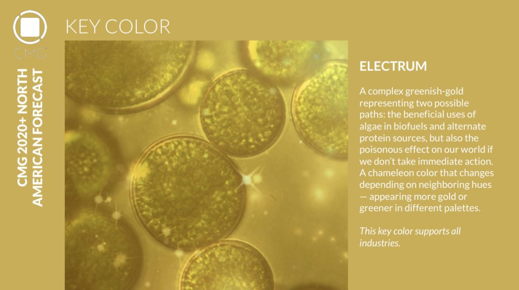
A color of alternating currents, Electrum is the 2020+ key trend color for North America. The complex, green influenced gold has a chameleon quality that allows it to shift between the two hues, and take on altered energy in concert with other hues. This is not a chameleon color to match the background, but one to enhance it.
The green and gold essences of Electrum represent different paths as 2020+ approaches, and symbolize the complexity of the future. The green element can signify beneficial components, be empowering and certainly represents the continuing trend of environmental awareness, but it’s no longer simply awareness, it is action. Discerning new uses of vegetation and algae as biofuels, and alternate protein sources, as well as building materials, will better connect us to the planet and help reassess how we use our resources.
The green is also a warning of the poisonous effect many of our actions have on our world. It is a sophisticated green that sparks discussion, planning, and engagement. Electrum is energizing as a color with which to take heed. Be bold, fix things, and be ready to celebrate the beauty that green can create.
Gold is an important component of Electrum. It not only offers a yellow cast to the color, but becomes the metallic influence over it as well. When shimmering with a metallic cast, it creates an otherworldly sense. It is not merely a mineral, but something that glows from within, offering unique qualities to whatever it embraces. It is why Electrum is seen as trend-forward across all industries, from fashion, to automotive, to home.
It may be complex with the ability to follow numerous paths, but Electrum is a key trend color for design, and for living, in an age of numerous possibilities.
CMG 2020+ Latin American Forecast Key Color – Ver-de-verdad
Perceiving everything around us with a new perspective, and determining our action, is a key trend in color and design, and life. It forms the foundation from which Latin America’s 2020+ Key Color, Ver-de-verdad, was created.
“Ver-de-verdad” translates to seeing things how they are and how they are evolving. An expressive green color, balanced with yellow and toned with black, Ver-de-verdad is a hue that represents an increased awareness and knowledge.
Once we’ve recognized our issues and challenges, we shall approach concepts from a proactive perspective; we can no longer stand idly by and merely observe what happens. We must be aware, we must engage, we must protect, and we must act in the interest of everyone, and everything, on the planet. Ver-de-verdad is the catalyst hue for new building materials and construction methods. It reminds us that we cannot treat refuse in a cavalier manner, we must respect our environment, and that every act matters. It immediately connects to who we are, where we are, and where we need to be.
Ver-de-verdad is a green reminiscent of nature. It conjures healing, of journeys into the forest primeval, and reminds us that we are part of a whole eco-system. Though we can’t control nature, we can control how we interact with it. We must take nature into account when designing our products and environments, not only to protect future nature but to be best prepared for natural disasters when they occur. Investigating and initiating new design methods that respect nature is key, and those designs must also withstand the force of nature. The green of Ver-de-verdad becomes a symbol for the beauty, and the potentially destructive character of nature, as well as a beacon of hope and understanding.
Ver-de-verdad is thoughtful and balanced. Toned with black, it displays its deep and contemplative side, and its influential yellow creates an ambitious representation of nature.
With evolving methods of creativity, we are aware, informed and ready to protect our environments. Ver-de-verdad represents the idea, and the goal, in one hopeful hue.
ABOUT COLOR MARKETING GROUP®
Color Marketing Group®, founded in 1962, is a not-for-profit international association of color design professionals who forecast color directions and is a forum for the exchange of all aspects color. Members represent a broad spectrum of designers, marketers, color scientists, consultants, educators, and artists. Color forecasting events are held throughout the world and the results from these events become part of the global World Color Forecast™ revealed at the annual International Summit.


