CMG Members Interpret and Use Color

At the Summit, Multi-industry CMG Member Panel Speakers Share Color Stories
We have heard time and again, a favorite part of the International Summit is meeting new members and reconnecting with familiar faces. People are fascinated with stories of how their colorful comrades interpret and use color. This year we decided to put a new spin on the Member Speaker. We are excited to present a panel comprised of 5 fellow members representing a variety of industries from around the world. This insightful discussion will be moderated by none other than our bowtie ambassador and Past CMG President, Mark Woodman.
CMG Member Panel Speaker Lineup
 Cecil Adams, Currey & Co.
Cecil Adams has worked in the home furnishings industry for well over 20 years, first as a Visual Merchandising Director, and later as VP and Creative Director for Expressions Custom Furniture, then Creative Director for rug manufacturer Trade Am. Upon leaving Trade Am, Cecil ran his own consulting business before coming to work at Currey & Company, where he is now VP and Creative Director. He has been with Currey since 2005.
In that time he has worked on both sides of the design collaboration table with designers including Candice Olson and Bunny Williams, institutions such as the Winterthur Museum and the Smithsonian, and textile fashion house Echo and Aviva Stanoff Designs.
Cecil likes to say he came into home furnishings through the door of visual merchandising and fashion, both areas that he is passionate about. He has developed product in all areas of the home furnishings world, including textiles, lighting, upholstery, and case goods.
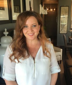 Stephanie Pierce, MasterBrand Cabinets
Stephanie Pierce is the director of design and trends for MasterBrand Cabinets, North America’s largest cabinet manufacturer. As part of her 16-year career in this industry, she has become an expert on cabinetry design for the home and is responsible for trend analysis and development of new products for multiple leading cabinetry brands.
Pierce supports MasterBrand’s new product launches and works collaboratively on innovation initiatives, including the development of new materials, finishes, styles, and organizational SKUs. In addition, she captures and presents industry trends for media, designers, and customers alongside also managing the company’s participation in trade shows, including the Kitchen and Bath Industry Show (KBIS).
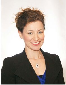 Janine May, Janine May Colour Designs
Janine May’s passion is taking corporations and people through exciting colour journeys. She offers her employer and consulting clients a proven ability to design purposeful and creative colour-fueled experiences to evolve and grow market share. May oversees the entire marketing campaign including budget, build key components inclusive of digital creation and management assets, social media strategy, show booth design, refinish, content creation, logistics, and stakeholder expectations. She compiles research, monitors trends, and establishes brand promotional ideas. Develops do-it-yourself (DIY) ideas and promotes professional solutions.
A self-described “Colour Geek,” Janine consistently provides innovative project design solutions for branding and marketing proposals. With over 7 years of experience in colour marketing design for global, trend-leading paint and finish companies, she is highly skilled in colour marketing and interior design with a broad range of skills encompassing design expertise, colour trend analysis and forecasting, and colour/design-based research (interior design, fashion, and industrial). She successfully creates ‘Trend Forward Design’ with purposeful creative colour sparked experiences. Janine can identify that the right selection of colour sells and can effectively leverage knowledge of colour trends and behavior to inform clients to make the best colour decisions.
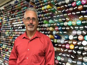 Kevin Harvey, Jafe Decorating
As a child, Kevin Harvey has always played with color! No matter in art, theatre, interior design, or camping (yes, primitive glamping), color and design have always been a part of his life. Kevin holds a B.A. in Theatre Arts from Indiana University. As a scenic designer/ scenic artist, he was found mixing paint from water glue and pigment/ dyes or recycling nearly dead latex paints. After nearly 18 years as a colorist for the plastic industry, Kevin has come back to his paint roots. Currently, he works at Jafe Decorating as a Colorist and Color Technologist.
Jafe Decorating is one of the leading US glass decorators, specializing in painted glass. Their customers range from the candle, floral, beverage, and lighting industries. With over 20 different standard painting techniques, they help customers create their own unique look for their various projects and brands.
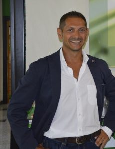 Francesco Monno, Estro Milano
Francesco Monno is an International Manager and Furniture Expert with more than 30-years of experience in large international furniture companies and multinational corporations like AkzoNobel and Axalta. Passionate about design, innovation, and trends with a strong focus on sales development, new markets start up, strategic marketing, and international teams coaching. Through constant communication with customers all over the world, Francesco strengthens the firm conviction that the future and success of companies go through digital marketing and social media. He is currently the Sales and Marketing Director of Estro Milano, an Italian high-end furniture company.
What Color Description Fits?
During this cozy conversation, we will listen in as Mark sits down with these colorful members to get their stories. What excites them? What keeps them motivated to create new products? What kind of crystal ball do they use? Most importantly, we want to know how they would describe themselves as a color.
How well do you know your fellow color tribe members? To have a little fun, we want you to guess which color description belongs to the appropriate panelist.
Color Description #1
First impressions can be misleading. A common assumption of this color is that it is stimulating and is often linked to anger, dominance, aggression, and danger. Certainly, it is overused to the point where its commonality can be easily overlooked at times, but when dependable guidance is needed, it is a powerful color to draw your attention.
Bold, confident and meaningful, this color has a polarizing appeal due to the inherent versatility of all that it can be. Not designed to be squared up in a box but rather, free to be impulsive, passionate and bound by intensity. The strength and the fragility of a color associated with life-giving blood… the color that defines both love and hate… within all these opposing complexities, it is still primary and pure.
Emotionally, RED is extremes, but its character is rooted in strength and unyielding warmth that does not limit the potential for passion in any form, and with passion, we all know there is purpose. I relate to red because, given the opportunity to operate at extremes on either side of the spectrum, in this, I find my passion for what I do to be unlimited.
Color Description #2
As a child, it is a kaleidoscope of colors: blue, red, green and yellow are the colors that characterize me, but I also love white and black. I love playing outdoors with other children and exploring the world on my bicycle with my best friends. Over time this kaleidoscope of colors evolves and focuses on red and orange, the colors that best represent my positive and dynamic spirit.
I become a tireless traveler, a blogger, passionate about design and fashion. In travels around the world between Europe, Asia and America I confront different cultures and traditions and the ability to read global trends allows me to grasp in advance the next trends in design and color.
Color Description #3
As a child, I would say I was a Cerulean Blue; bright, playful, curious, and calm. By age 12, the blue darkens almost to a Moonless Night Black. At age 16 my color is a Muddy Black. This reflects the harsh words and actions from others which eroded my self-esteem.
During college, I started to cleanse my pigpen aura while developing deeper chromatic colors. Those dark emotional teenage years were the catalyst for me to polish my aura with the help of positive people. From reds, yellows, greens, blues, and violets I claimed each color in all their hues and shades.
For me, I have to claim and exude the diversity of all colors to match all the peaks and valleys of life journeys. Being able to choose my color, shade, and hue has served me well; to keep me flexible in any situation. But right now, this very minute, I would say I am Pantone 18-3615 with a dose of Merck Pacific Twinkle. This hue of violet is the perfect blend of red and blue. Chromatic but not overpowering. It is a complexed color but appears to be simple. It also harmoniously balances the light and dark. The Pacific Twinkle gives the color more shimmer and an additional layer. This shifts the color more blue from the blue/green sparkles of the Pacific Twinkle.
Color Description #4
At this time in my life, my favorite color is orange. It has been this way for close to 15 years. For me, it represents communication and energy, both of which can always use a bit of lift for me from time to time. I have used it as an accent in my home in textiles and wall coloring as well as in my work for ceramics and textiles.
Once you let your friends know you like a color, things begin to appear in your life that are that color. Consequently, I have a bunch of orange stuff now. As a kid, my Mom liked to put me in yellow for my school pictures, but my favorite color was purple. I was allowed to have my room be whatever color I liked so I had a grape soda purple room with purple curtains and bedspread. It was a bit like living inside a grape.
Color Description #5
Phenomenal Purple/Royal Velvet are my favorite colors besides a shocking magenta. Shades of purple are key to me. Lavender is a huge part of my personal life as I use this as an antidote to the business of urban life. Uniquely, I believe this is my hyper-color connection to nature, and oddly enough it involves all your senses. Sounds of bees and swaying lavender in the wind, the therapeutic solitude, and time for thoughtfulness.
Magenta is said to be a color of sheer spiritual transformation, and historically purples are associated with spirituality. I am not religious but there is a certain mystique to these colors which I cannot get enough of. Magenta is transformative and found everywhere in nature, as new varieties of horticulture (thru bioengineering). Plus, you are extremely approachable if you are wearing magenta—I believe it’s the overall color energy that connects with people of almost all cultures.
Both of these colors are “Soul Searching Colors”: Magenta is about multidimensional transformation for me. Phenomenal Purple is about a therapeutic multidimensional color for wellness and healing. By the way, each of these colors has super long wavelengths of color and light…. the highest frequency is key!
INTRIGUED?
Attend the International Summit where the
Multi-industry CMG Member Panel Speakers will reveal their true colors.
See you in Philadelphia, November 9-11!