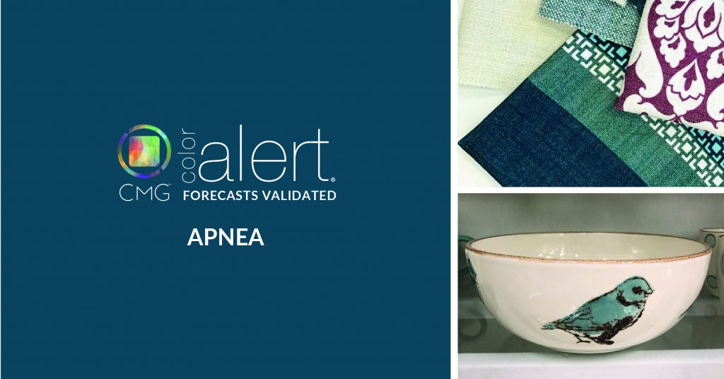
MARCH COLOR ALERT® – Apnea
Apnea is a color of contemplation.
Inspired by the ongoing deep cleaning of the planet’s oceans, this murky blue-green suggests the deep waters as well as contemplative meaning. It is multi-layered as it celebrates its dual color influencers, values deeper meaning, and exhibits a sense of the familiar.
Emerging in 2021 as a prediction of CMG European meetings in 2019, it is a color already taking on the design world in ways recognizable and sometimes surprising. Apnea is considered appropriate for all industries and though often considered reserved and intuitive, it is always open-minded to ideas. In still stressful times, it is imbued with a sense of honesty and trust that translates to a calming vibe. That encouraging, open-minded quality propels Apnea’s use in everything from fashion to SUVs to home appliances.
Home is not just a location, it is a feeling, which Apnea translates to anything it graces. A sofa, coffee mug, serving bowl, or wall tiles are all more engaging with this trend forward color. As a new color it is not what you thought it was at first glance; it is new and fresh and desirable. It can transport you, almost literally, along the highway, offer welcome on an entrance door, or add a natural element to electronics.
Reveling in its unique stance between two colors while simultaneously embracing its cool and dark aura, Apnea is especially adept at taking on special effects and finishes. Color shifting with iridescent effects, Apnea takes on the glory of peacock plumage and in a high-gloss finish appears liquid and as deep as the seas. It can appear regal in soft textiles like velvet and wool or look fast and racy in shiny metallic effects. No matter where it appears, Apnea offers a moment to stop and get lost in the color and its meanings.
A color that emerged from discussions of deep cleaning, encourages deep thinking, and is familiar enough to be deeply moving, Apnea is here now to embrace design.
Stay connected in color by signing up to receive our FREE monthly Color Alert® and Color Connection Newsletter. Follow #ColorAlert #ColorSells

About CMG’s Color Alert®
View our Color Alert Archives