We have just revealed our 2023+ Key Colors from Europe, North America, Asia Pacific, and Latin America.
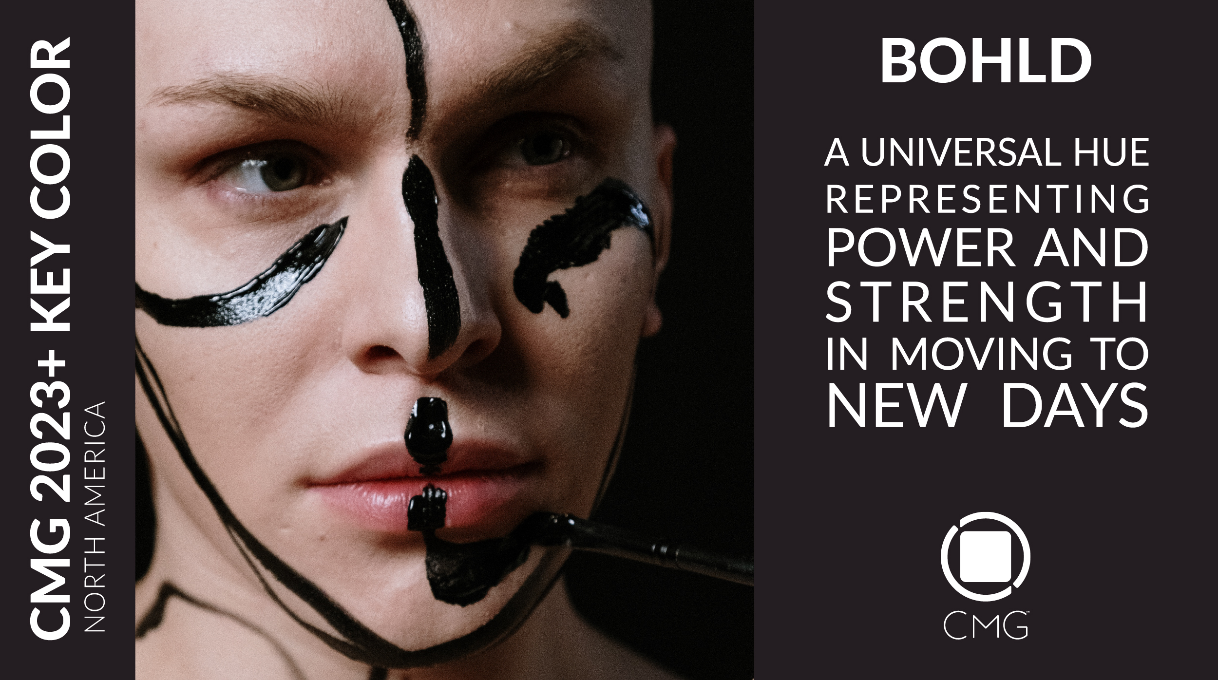
CMG’s 2023+ North American Key Color is “BOHLD”. A true, unnuanced, neutral black, Bohld is a grounding, rich, universal hue representing strength and power moving to new days. It allows us to make equally serious and joyous bold statements. Its darkness is not sad nor subdued, but rather contemplative and expressive, exciting, and courageous. Bohld celebrates diversity and inclusion, a color of positive transformation! Bohld celebrates You!
The reckoning of race, gender identity, age, accessibility, financial inequity, and prejudice will usher in a culture that overpowers fear with friendly demonstrations and mindful dialogue, deeply inspiring and embracing the changes underway.
Diversity, inclusion and belonging are no longer ordinary words, but rather key concepts resounding strong value implications on all levels. While diversity represents different people within an organization, inclusion ensures that everyone has an equal opportunity to contribute to, and influence, every part and level of an organization, and belonging ascertains that everyone feels safe.
Diversity and inclusion are not merely noted and accepted, they are embraced and honored. Through product design, brands will further represent visible minorities to better celebrate all their client base. In the skies, some airlines are adopting gender-neutral greetings to be inclusive of all passengers on a flight. Consumers are choosing to do business with companies demonstrating a proven commitment to diversity and inclusion practices.
Black is an ancient color that has often received a second-place stance but will now have its moment to shine. Bohld gives a voice to the silenced and the unnoticed. In the absence of light, it embodies the sum of all colors. Its silent “h” does not shadow the symbolism of the peaceful yet elegant declaration that this achromatic color announces, but rather acts as an insignia for the whispered assertion it spreads. Bohld steps forward as a representation of positive and progressive change. It has no physical or virtual boundaries and touches many demographics on a global scale.
Bohld may act as a powerful, escort for all other colors, as a new expression of passion and power, but it stands equally proud on its own, assuming the sophistication inherited from decades of timeless history in the design and color chronicles.
Bohld is anticipated to emerge on a global scale in various market segments such as Appliances, Architectural Commercial & Residential Exteriors, Automotive Interiors & Exteriors, Fashion & Accessories, Furniture Interiors, Home Décor & Accessories, Lighting, and Textiles.
CMG’s 2023+ European Key Color is REVIVAL GREEN. A low chroma, greyish, blue-based green that is effortless to the eyes, Revival Green symbolizes the embedding of our love for nature and represents our need to protect her. Natural colors will enhance consumer’s choices in selecting more environmentally friendly products.
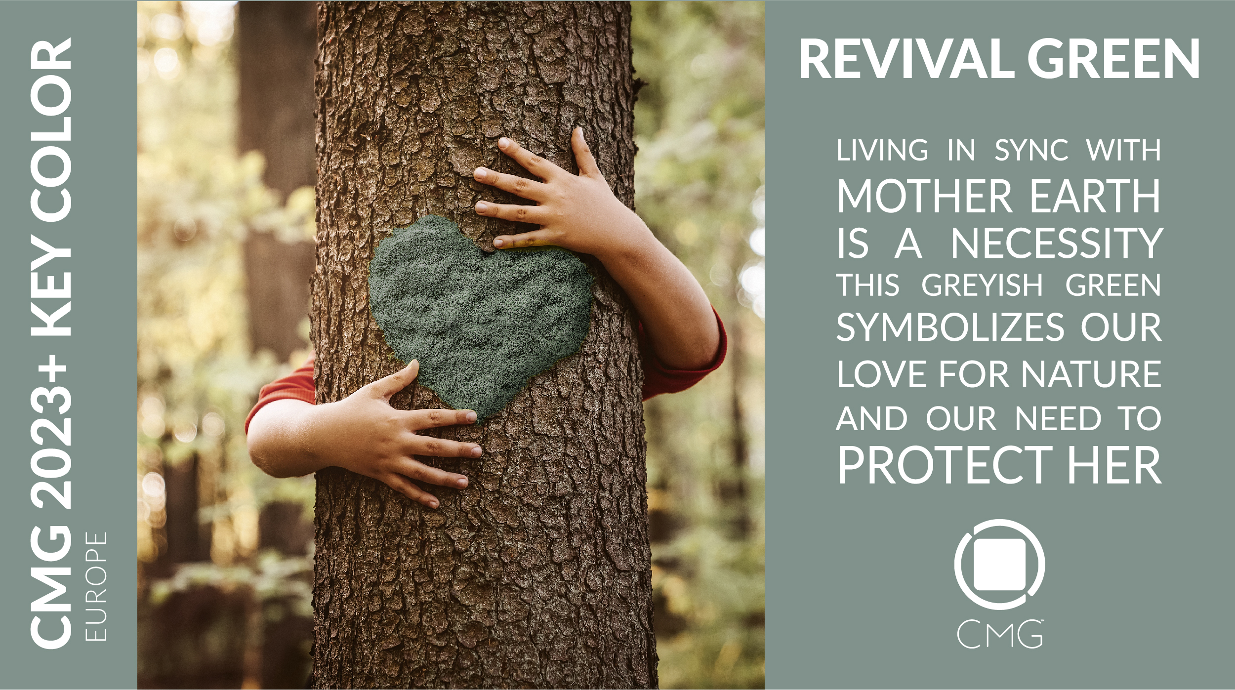
Revival Green incarnates the need for further sustainable lifestyles where we care for ourselves. But to be able to do so, we first need to care for our planet. Living in sync with Mother Earth is a necessity articulated by the subtle, greyish, blue-influenced, green tone. It does not scream for change nor optimism, but it delicately pushes us towards the right direction.
Revival Green is effortless to the eyes. It is a symbol of our love for nature. It speaks in support of the necessity to protect her. The natural quality of this color has the energy to influence consumers choices for more environmentally friendly products. It brings along a longevity and permanence qualities to a product, a concept that is becoming key as we grew accustomed to accumulating waste and getting rid of items that are no longer trending or do not serve our current needs.
The introduction of natural colors, such as this green, into our homes, offices and public spaces stimulates feelings of calmness that allow us to connect with nature even when living in urban areas. When we surround ourselves with nature and beauty, we enhance our wellbeing and that of others. When we breath in serene environments, supported by the selection of the appropriate and ecological color, we may contribute to the wellbeing of the inhabitants who may have the ability to enact regenerative frequencies into the planet.
Revival Green is suggested with a standard finish and is anticipated to emerge in various market sectors, such as Automotive Exteriors & Interiors, Consumer Goods, Home Décor & Accessories, Fashion & Accessories, Furniture Interiors, Paints & Wallcoverings Interiors, and Textiles, in the European region.
CMG’s 2023 Asia Pacific Key Color is E.V. A low chroma, luminous, neon-like blue with whispers of natural green notes, E.V. underlines how the widespread adoption of electric vehicles (EV) will mark a turning point for sustainability as well as for personal and commercial transportation.

E.V. represents mobility, not only in the sense of transportation, but also in the determination to move forward with new revolutionary technologies for clean energy. Conventional foliage green, traditionally used as symbol of the environment, gives ground to a vibrant blue to communicate environmentally related matters. This color telegraphs the enthusiasm around the topic of clean energy and new methods of sustainability, as we witness the world deliberating the shift to battery-powered vehicles and alternative energy, and the associated issues yet to be resolved.
The mass adaption of E.V.’s to replace fossil fuel powered vehicles is expected to reduce environmental pollution and avoid dependence on non-renewable energy. Battery, motor, and energy storage technologies, along with advanced control algorithms, will contribute to E.V. performance improvements. Safety, performance, convenience, cost, and battery recycling will play important roles in the sustainable future of electric vehicles.
To further widespread electric vehicles on the roads, it is necessary to develop the infrastructure, charging technologies and charging stations. The development and application of advanced control technologies along with artificial intelligence (AI) to improve performance and flexible operation of E.V.s, represent new challenges and big opportunities to further the developments.
Tesla and other organizations are instrumental in finding ways to recycle battery components so they can be used multiple times instead of discarding them and creating new land pollutants. The Tesla-Redwood partnership provides the technology to extract and recycle battery components not only from E.V. batteries, but also from electronic devices, including old ones from past decades. It is believed that this could prove to be the largest resource of precious minerals like nickel, cobalt, copper, graphite, and lithium. It is also extremely cost effective, which drives down the cost of E.V.s, allowing for a faster and wider adaption. This is truly “end-to-end” recycling.
These new, exciting, and innovative technologies call for a color that is vibrant with the power to convey enthusiasm and anticipation. Hence a green-based blue that supersedes the traditional vegetation green to represent matters related to the environment and technology.
E.V. is suggested with a glossy finish and is anticipated to appear in markets such as Automotive Exteriors, Consumer Goods, Health & Wellness, Sporting Goods, Sports Vehicles and Visual Communications in the four regions: Asia Pacific, Europe, Latin America and North America.
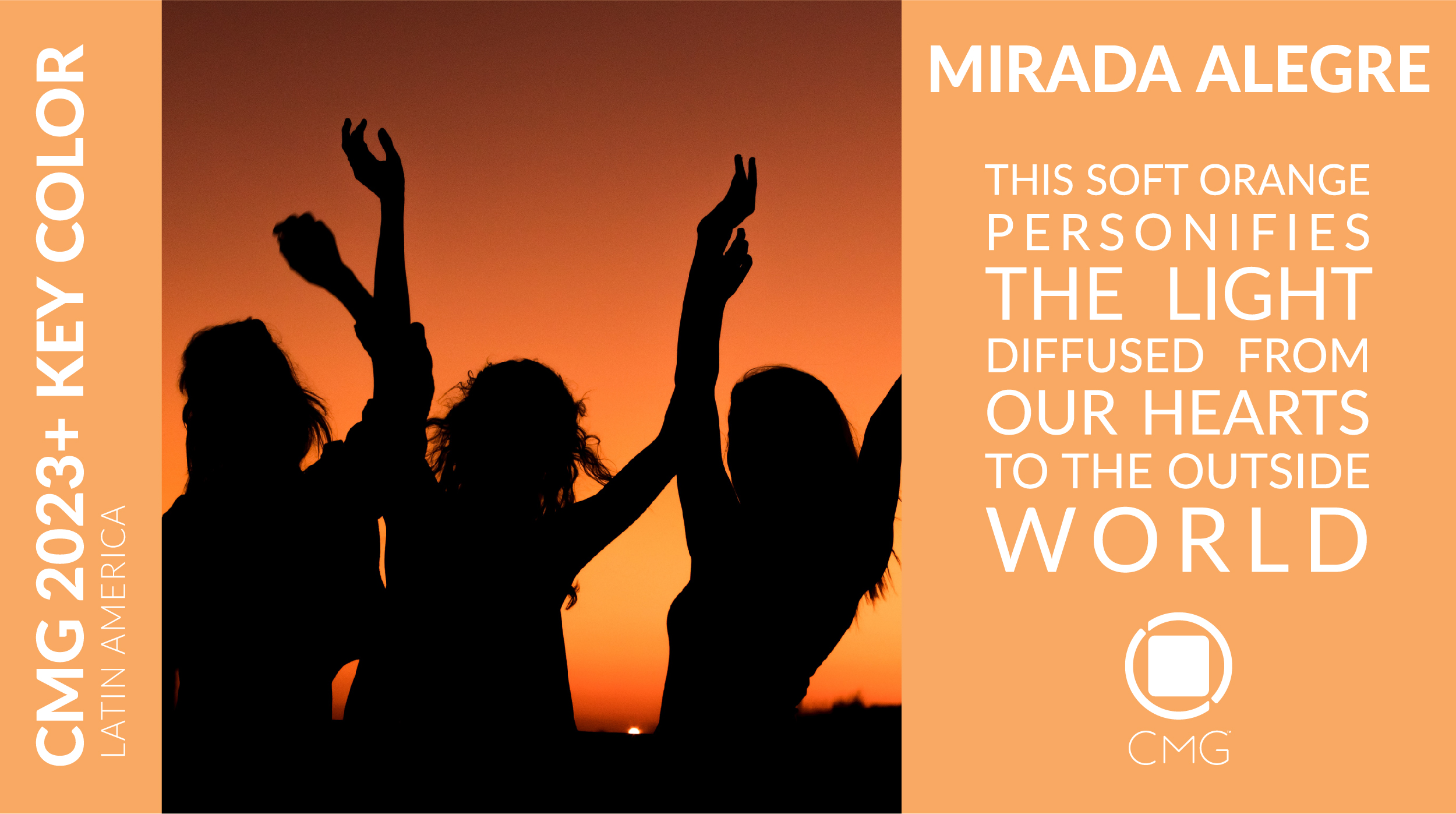
CMG’S 2023 Latin American Key Color is MIRADA ALLEGRE. A medium chromaticity, creamy, soft orange with a sense of balance between yellow and red yet loosely permeating the warmness of yellow. Mirada Alegre, Spanish for Joyful Look, personifies the light diffused from our hearts to the outside world. The energy drawn to allow us to recuperate the lost moments of our lives as the pandemic ravaged our existence. The glow that fulfills us with joy and life.
The year 2023 is a year of thriving and externalizing our emotions. A year of change. Change that will not happen abruptly, but rather by baby steps as we re-learn how to walk again, run again and be happy again.
We seek to live life as we knew it. However, we will learn how to value it much more, and find joy in the simplicities of living the crazy life, “living la vida loca”, but in a safe manner. Mirada Alegre characterizes the warmth that will allow us to seize the feelings we repressed during lockdowns and quarantines and transform them into new experiences.
With this orange tone, and within this orange space, we are allowed to celebrate life, live a party, and regain that joy we once had before the pandemic.
Mirada Alegre symbolizes the joy and euphoria of exchanging eye contact with loved ones. A simple look filled with meanings and connotations that will transmit the feelings of delight for being able to look at the eyes of another person, not through the static surfaces of our screens, but through physical gestures we are familiar with, enabling to breathe a little of “living the crazy life”.
By its meaningful symbolism, Mirada Alegre can be a comprehensive color that harmonizes well with many colors and different tonalities to create either calming or energizing moods.
To create calming moods, it can be juxtaposed to blue tones that represent the air and water of the beach, or with neutrals to establish tranquility and security. To create energizing atmospheres, it will unite well with bright green to represent rebirth, and robust shades of fuchsia or dark grey to waltz on the edges of reality.
Mirada Alegre is anticipated to emerge in applications for Consumer Goods, Home Decor & Accessories, Fashion & Accessories, Paints & Wallcoverings Interiors, and Textiles in Latin America. It is also expected to be smuggled to North America as we witness the globalization of color.
CMG’s Key Color Selection Process
The regional Key Color is selected out of the 16 colors included in the regional forecast. The choice is made based on the color direction of the forecast, the importance of the color family to the forecast, the significance of the specific color to the color direction, and how the color best represents the Color Stories or the general mood of the stories.
Before the final choice is made, various colors are shortlisted by the steering committee. The shortlist is based on various parameters, which may include one or more of the following:
- The number of times a color was submitted by participants during a ChromaZone®. Sometimes, it’s not the exact color that is submitted various times, but variations of it.
- The color was selected as a
- ChromaZone® Story Key Color or ChromaZone Key Color.
- The most predominant color family in the Forecast. This is based on the number of colors within a color family.
- The most unexpected color in the Forecast, but closely related and representative of the general mood of the Color Stories.
Shortlisted colors are discussed one by one with an explanation of what they signify and symbolize, and why they will be important to represent the forecast. Following discussions, the committee votes on the colors until one color ends up with the most votes.