2010’s:
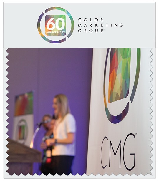
2016: After nearly two decades with the same branding and logo, CMG launches its new brand identity at the International Summit held in Albuquerque, NM. The initiative included a new logo, updated website, and refreshed messaging. The shape in the center of the new logo symbolizes CMG as a group of professionals spanning an array of fields and practices. The mosaic pattern represents our collective experiences and interpretations coming together as a whole. And the outer circle, with its fusion of continuous color, is representative of the always-moving, always-shifting circle of trends and ideas. The concepts and designs were created and sponsored by CMG member, Britton Marketing and Design Group.
Also emerging from this re-branding was our Rally Cry, which ends with, “We connect in color. We collaborate in color. We create in color.”
JOIN OUR MAILING LIST TO CONNECT IN COLOR WITH CMG’S GLOBAL COMMUNITY!
Swatchbook is a bi-monthly feature focused on key moments in CMG’s history.
SIGN UP TO RECEIVE OUR BI-MONTHLY SWATCHBOOK

