Introducing our 2025+ Key Colors from Asia Pacific, Europe, Latin America, and North America.
As part of the World Color Forecast™ presented at this week's CMG Summit Reveal, we announced the Key Colors for 2025. Four global regions, Asia Pacific, Europe, Latin America and North America, each identified the Key Color from their 16 forecasted colors. The selection of the Key Color is based on the color direction of the Forecast, the importance of the color family to the Forecast, the significance of the specific color to the color direction and how the color best represents the Color Stories.
CMG 2025+ Asia Pacific Key Color - Explore

Explore is a fascinating low chroma, rich, warm, near-black red, adorned with subtle hints of blue. This unique hue holds immense significance as it encompasses multiple facets of personal and collective growth. Its profound association with blending recycled materials epitomizes sustainability and environmental consciousness, reflecting a mindful approach to living.
Moreover, the color’s representation of a deep meditative state of mind adds to its allure, hinting at the potential for introspection and self-discovery.
In this fast-paced world, Explore serves as a counterbalance to the fast-paced world, encouraging individuals to pause, reflect, rediscover themselves and embark on a transformative journey towards better living and meaningful experiences.
The rich, warm tone of Explore evokes a sense of genuine self-assessment and exploration, inviting people to embrace and cultivate their artistic and wild sides and find innovative solutions to everyday challenges. In the distinct darkness of this color, we find an illuminating guiding beacon, a symbol of harmonious blends of recycling, meditation, and creativity, fostering a future that harmonizes with nature and empowers individuals to reach their fullest potential.
CMG 2025+ European Key Color - Essence
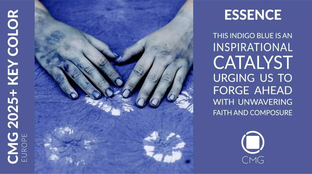
Essence is an enigmatic medium chroma indigo blue that embodies a perfect balance between brightness and chromaticness.
This mesmerizing color holds an irresistible allure, captivating the senses with its subtle yet powerful presence. Its vibrant red spectrum serves as a nostalgic bridge, evoking vivid and mesmerizing memories of times past while foreshadowing the boundless possibilities of the future.
The meticulous selection of this color as the Key Color for 2025+ stems from its ability to represent the vast array of captivating blues that are anticipated to shape the design landscape in the coming years. As an emblem of purity and strength, this hue, aptly named Essence, encapsulates the very essence of progress and resilience. It serves as an inspirational catalyst, urging us to forge ahead with unwavering faith and tranquil composure in the face of challenges.
Essence symbolizes a renewed sense of purpose and a commitment to embracing the present moment. It encourages us to cherish the here and now, recognizing that it is in the present where our greatest potential lies. With open hearts and minds, we are called to embark on a journey of exploration and growth, guided by the spirit of Essence, a color that resonates with the zeitgeist of 2025 and beyond.
CMG 2025+ Latin American Key Color - Feel Real

Feel Real is a low chroma red with subtle hints of yellow that represents the juxtaposition between the human element and technology. It symbolizes our acceptance of our true selves despite our vulnerabilities, mistakes, and the ever-changing circumstances we face.
Derived from the evolution of more vibrant red tones forecasted in recent years, Feel Real exhibits a dusty warmth reminiscent of various hues such as pink, red, brown, and yellow, reminding us of the artistry found in handcrafted clay objects like ceramics and bricks. Its inherent desire to embody authenticity makes it an ideal color for a multicultural society.
Feel Real transcends individual boundaries and embraces all backgrounds and age groups, encapsulating the essence of humanity and reflecting the diverse facets of society, including aspects like recyclability and technology.
It fosters a sense of empathetic understanding towards the realities intertwined with technological advancements, inviting us to find solace and compassion within this complex landscape.
CMG 2025+ North American Key Color - Forever-green
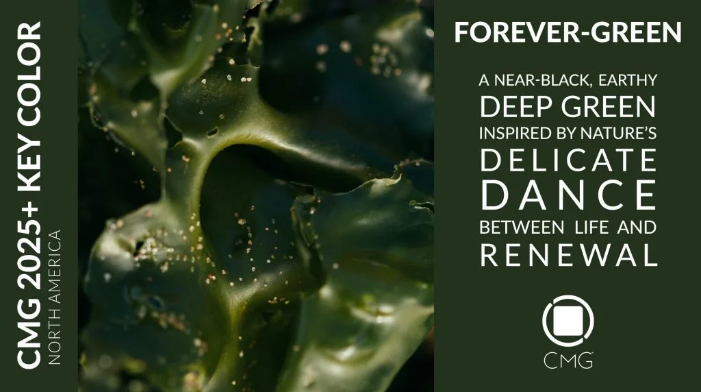
A powerful and timeless color, Forever-green emerges as a defining Key Color. A deep green with a modicum of yellow, this near-black hue holds a classic, mystical charm that captivates the heart.
Drawing inspiration from the natural world and the delicate dance between life and renewal, Forever-green recounts a lifelong tale of harmony and balance. Rooted in the mineral-rich deposits of leftover waste materials, Forever-green symbolizes the readiness for new life to emerge—a testament to resilience and the regenerative power within the fabric of existence.
As the global zeitgeist shifted towards embracing sustainability and environmental consciousness, Forever-green emerges as an emblem of promise and transformation, a symbol of unity and cooperation, recognizing that harmony with nature is essential for the prosperity of future generations.
With its sense of earthy elegance and forever optimism, Forever-green mirrors the beauty of the natural world, illuminating a path towards a brighter and greener future.
Not bound by fleeting trends or passing fads, Forever-green is part of our natural tapestry, a profound expression of the human spirit and the promise of renewal.
CMG's Key Color Selection Process
Four global regions, Asia Pacific, Europe, Latin America and North America, each identify their Key Color from their 16 forecasted colors. The choice is made based on the color direction of the Forecast, the importance of the color family to the Forecast, the significance of the specific color to the color direction, and how the color best represents the Color Stories or the general mood of the stories.
Before the final choice is made, various colors are shortlisted by the Steering Committee. The shortlist is based on various parameters, which may include one or more of the following:
The number of times a color was submitted by participants during a ChromaZone®. Sometimes, it’s not the exact color that is submitted various times, but variations of it.
The color was selected as a ChromaZone Story Key Color or ChromaZone Key Color.
The most predominant color family in the Forecast. This is based on the number of colors within a color family.
The most unexpected color in the Forecast, but closely related and representative of the general mood of the Color Stories.
Shortlisted colors are discussed one by one with an explanation of what they signify and symbolize, and why they will be important to represent the forecast. Following discussions, the committee votes on the colors until one color ends up with the most votes.